
Persono Website Redesign
Tech Lead & UI/UX Lead


Sleep Persono
Our team had chosen to work with the Sleep Persono company–"a multidisciplinary team that brings together UX designers, software engineers, data scientists, inbound marketing specialists, product managers, operations managers, textile experts, and sleep and technology consultants" based in Brazil. The Persono team has designed a “smart pillow” that acts as a sleep tracker. Accompanied with the app sleep–the persono project is able to record and provide its users sleep data analytics and provide resources on what their data says about their sleep and how to improve their sleep.
Project Proposal
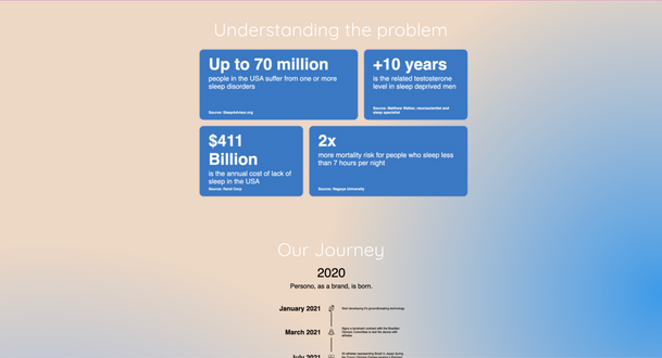
The Persono team reached out with a vision for a website redesign. According to their current website engagement for their product, the persono team has found they’d had lower conversion rates compared to their projected pre-launch goals.
The problems they are coming across concerning low engagement highly affect their purpose as they lose chances to interact with individuals that would need sleep regulation and improvement more–a voiced audience that they wish to target were young adults that struggle with maintaining a consistent sleep schedule.


Possible audiences that they wish to campaign and appeal to with a website redesign would be customers who target healthy living as well as those who appreciate new tech and innovation, comfort-home fashion audiences, high income families and parents of toddlers, wellness coaches, those who practice yoga, and those who live stress-free in that order.
With these campaigns and target audiences in mind they want to successfully expand their product to the U.S. market where their influence would be higher and the popularity of trending technology would be rising.
Things we noticed about the original site that others had given in feedback were:
"The site is too cluttered"
-
There were too many things on the home landing page
“There's too much content in the home page that I feel could be put in a separate location.”
2. Better organization was needed
“The color scheme is complicated and the blacks and whites are too contrasting. It doesn't unify the site.”
3. The website's general aesthetic and color scheme needed a change.
Creative Process
The creative process took two different site iterations and multiple user-testing and feedback. By the end of the design process we had created two site versions where one tested layout and the other tested a different aesthetic approach to presenting the product.


First Design
Our first design included a reimagined landing page, with less content (taking out competitor comparisons, size comparisons, and more). This design also tested a different color palette sticking to a darker or all-black aesthetic. We wanted to make the product more appealing and show off more of its features as a selling point to cause potential customers to interact with the site more and sign up for the newsletter.
Our second design focused more on different aesthetics compared to the first website as well as the first redesign. Feedback included comments criticizing the navigation, the aesthetic being "amateur" looking, and overall an unprofessional look to the site. We took all of the comments into account and decided to rearrange the site again and stick to a more coherent color palette.


Second Design
Final Design


We decided to experiment with a new color palette that would match the style sheet the Persono Team sent us to maintain their identity.
Product placement and feature details were extremely important to us. We wanted to ensure that the flow and scrolling interaction would allow the user to effortlessly learn more about the product.


Most importantly we decided to make the waitlist menu one of the biggest components and easiest to access. In order to improve site interaction we needed to make sure that the waitlist was visible in the landing page and reocurring in other pages.
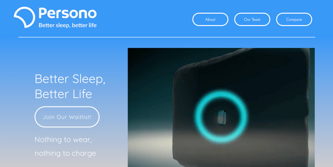
The last iteration was positively received. Comments included praise for the site's smoothness and navigation. Interviewees said that the landing page was far more pleasing and easy to look at, the transitions between each section were seamless, and the overall general aesthetic felt cohesive.
Limitations & Future Recommendations
It's progressive to have a positive outlook for the website but to move forward we must view the final design in retrospect. With the time constriction of 10 weeks, there were features our team wished we could have implemented and more research that could have been done. One thing was to check how many leads have increased/decreased after the new site was published in comparison to the original Persono website and change accordingly. Moreover, we felt the website Website is not as technologically adept/well developed as the original.
Had we completed our process differently, we would have reached out to the team more often to approve simplified information to address the content overflow on the landing page. Secondly, the Interviews & survey questions we conducted were not as well-developed as we'd like in terms of specificity of responses. Lastly, although we included the company's pillow diagram we would like to have included a more interactive diagram that explains the use of the product more.